Scenes From the Dream State — AI Animated Vignettes
Not enough ratings yet
be the one who decides
The breakdown
Notes
No notes yet. Rate the film and the note box appears.
More from Kelly Boesch AI Art
all their films → 2:53
2:53
Surreal AI Dance Video - Saffron and Smoke - Kelly Boesch | 4K
Kelly Boesch AI Art · 2.8M YT views
unrated
 3:09
3:09
Bizarre AI Short Film | "It’s La Vida Loca" - Kelly Boesch | 4K
Kelly Boesch AI Art · 1.9M YT views
unrated
 2:44
MUSIC VIDEO
2:44
MUSIC VIDEO
Scenic AI Music Video | "Golden In The Sun" - Kelly Boesch | 4K
Kelly Boesch AI Art · 1.8M YT views
unrated
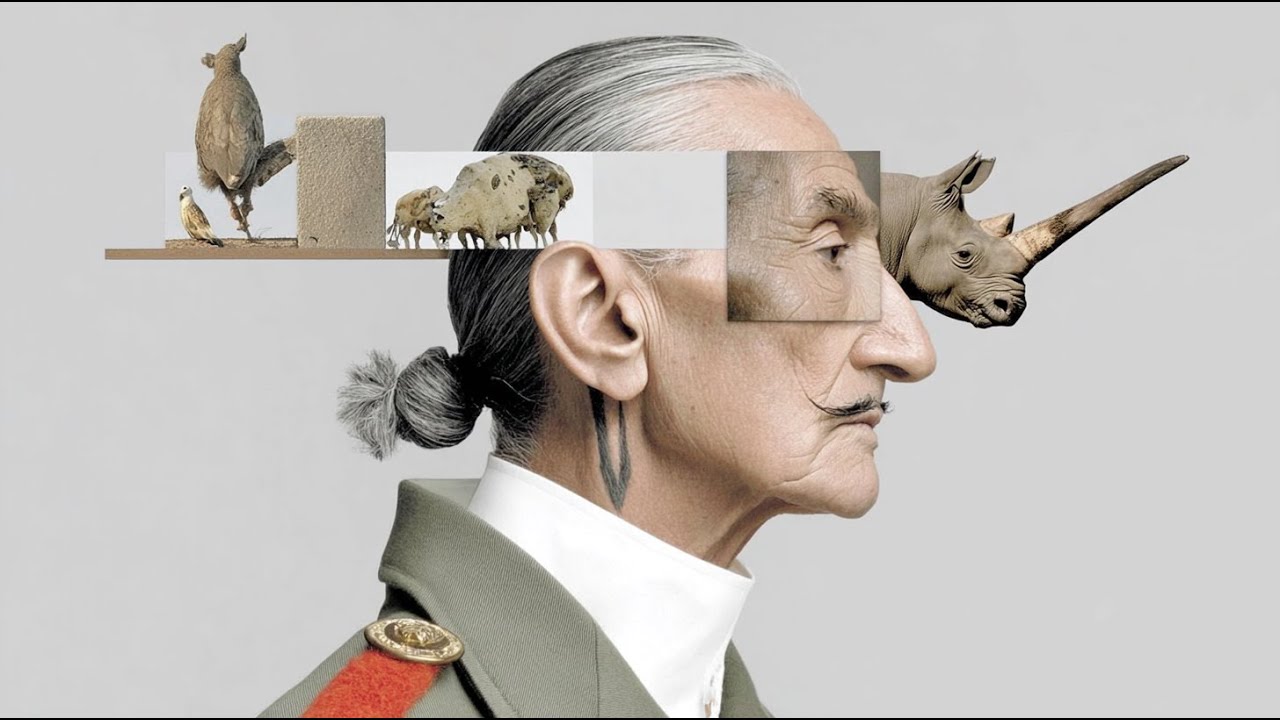 2:56
MUSIC VIDEO
2:56
MUSIC VIDEO
Surreal AI Official Music Video - Quiet Rebellion - Kelly Boesch | 4K
Kelly Boesch AI Art · 1.8M YT views
unrated
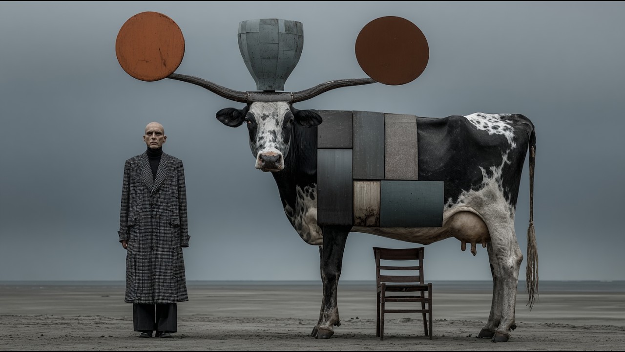 3:00
3:00
Strange Surreal Scenes - Get Inside My Mind (Take A Ride) - 4K
Kelly Boesch AI Art · 1.7M YT views
unrated
 3:33
MUSIC VIDEO
3:33
MUSIC VIDEO
Kelly Boesch Official Music Video - Beautiful Things - 4K
Kelly Boesch AI Art · 1.6M YT views
unrated
More like this
 0:42
▯︎
0:42
▯︎
Finish what you started with SUNO 🔥 #suno #musicproduction #sponsored #ad
Misstiq · 124.6M YT views
unrated
 0:36
▯︎
0:36
▯︎
Ep 23: The Gupta Arks (Rome & The Cosmic Nullifier)
Gossip Goblin · 15.4M YT views
unrated
 1:24
▯︎
1:24
▯︎
The Twelfth Cycle of Humanity
Gossip Goblin · 10.9M YT views
unrated
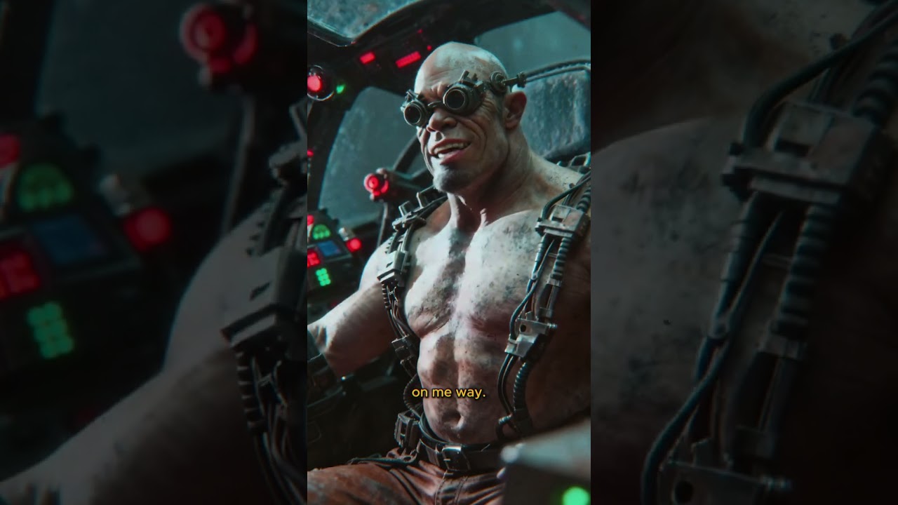 1:27
▯︎
1:27
▯︎
Chewing Slag (The Second Cycle of Humanity)
Gossip Goblin · 8.3M YT views
unrated
 0:57
▯︎
0:57
▯︎
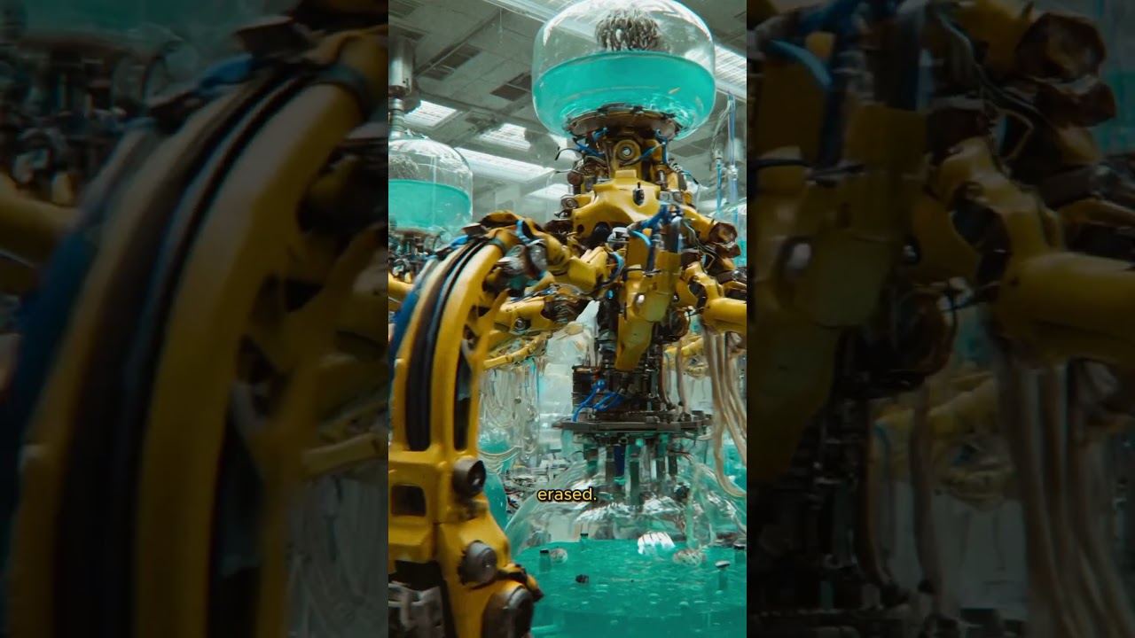
The Tenth Cycle of Humanity
Gossip Goblin · 7.9M YT views
unrated
 1:07
▯︎
1:07
▯︎
Ep 4: The Mauryan Machine (The Story of Atlantis)
Gossip Goblin · 7M YT views
unrated
Over on YouTube
Top comments under the original upload. Not popcorn.movie ratings, just what the room is saying.